
Plan Your Next Home Upgrade With Benjamin Moore's 2023 Colour Trends
Brace yourself... Benjamin Moore just released their Colour Trends for 2023 and we were so excited to discover all the wonderful shades. From deep chocolate to radiant navy, all eight hues exude confidence and were chosen for their distinct presence and personality. Traditional colour? No, not this year.
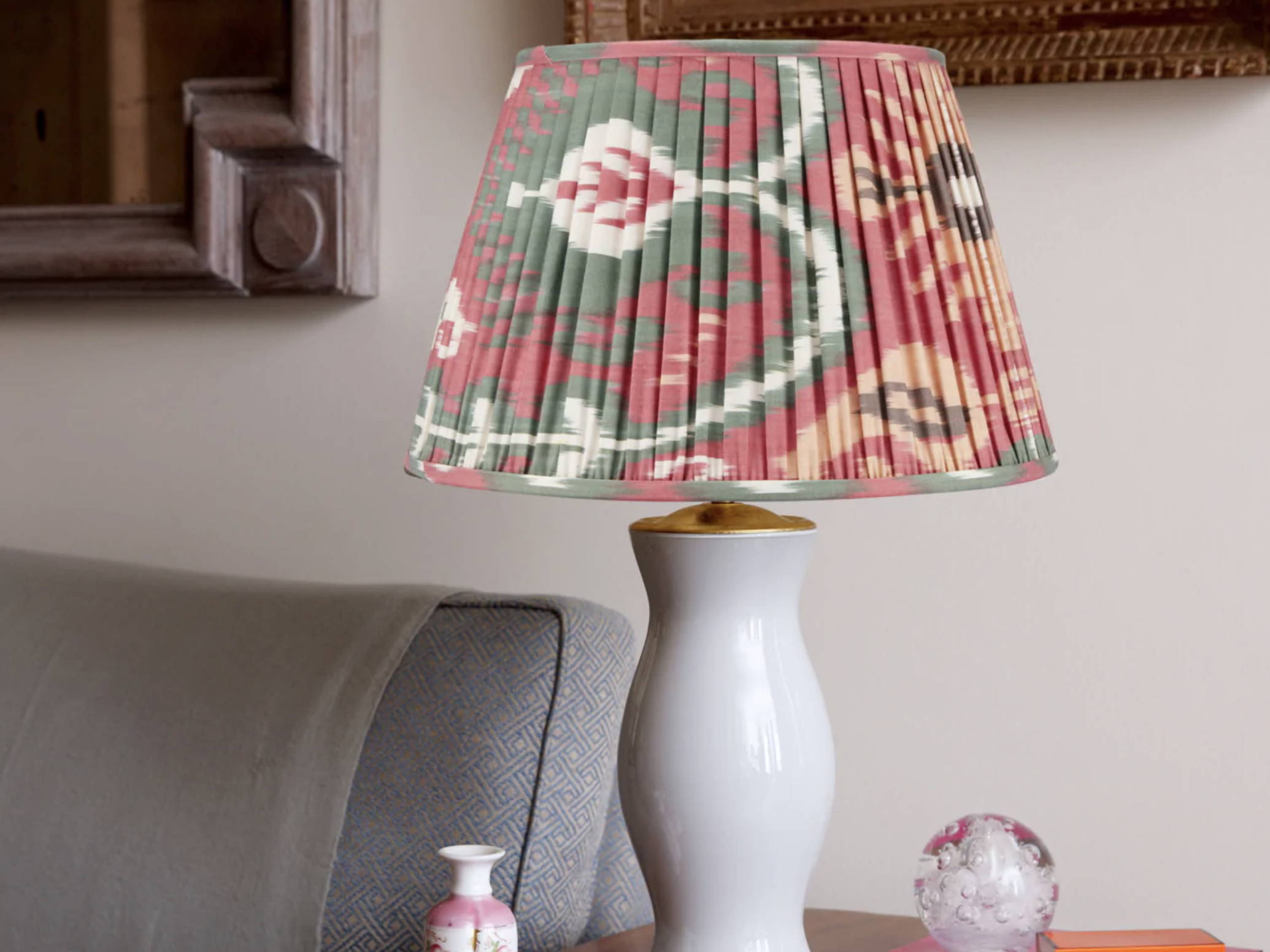
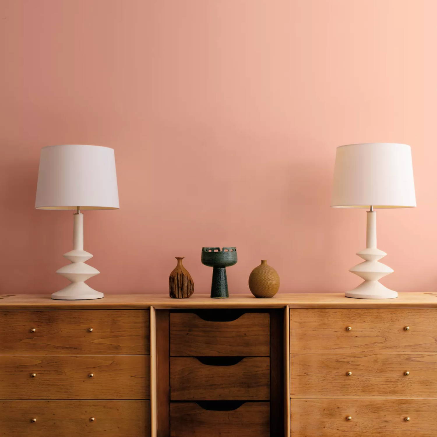
1. RASPBERRY BLUSH, 2008-30
Benjamin Moore characterises the vibrant and punchy Raspberry Blush as the "definition of charismatic colour" and we could not agree more. Fusing a hint of orange with blush pink, you can easily incorporate a touch of Raspberry Pink in your home decor through accessories such as table lamps, cushions, throws and trays. Pairing well with an array of neutrals, such as navy, cream, white and brown, Raspberry Blush is a colour that can be used subtly or on a larger scale through furniture and walls.
"A vivacious shade of coral tinged with pink, Raspberry Blush enlivens the senses with an electric optimism."
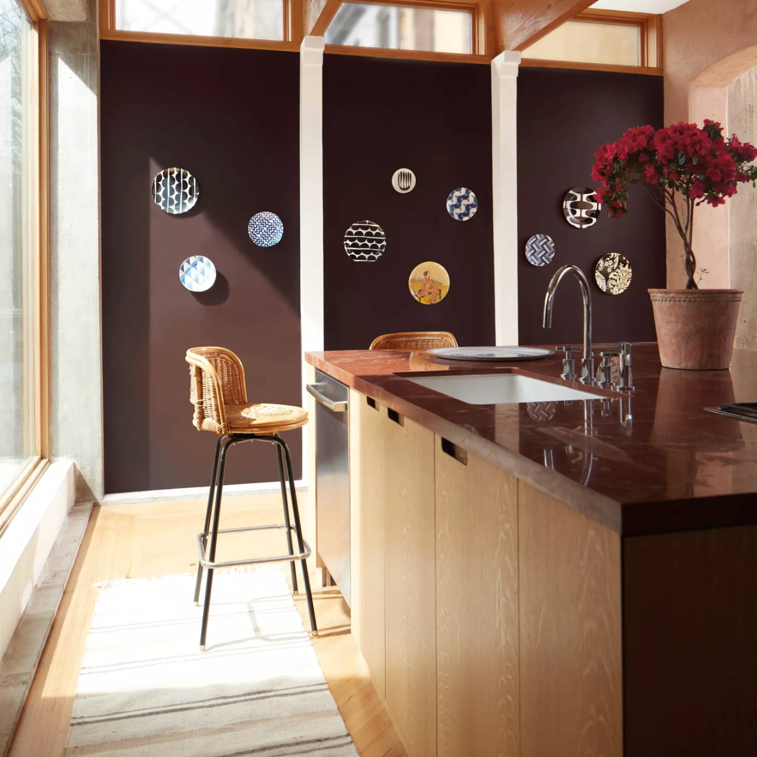
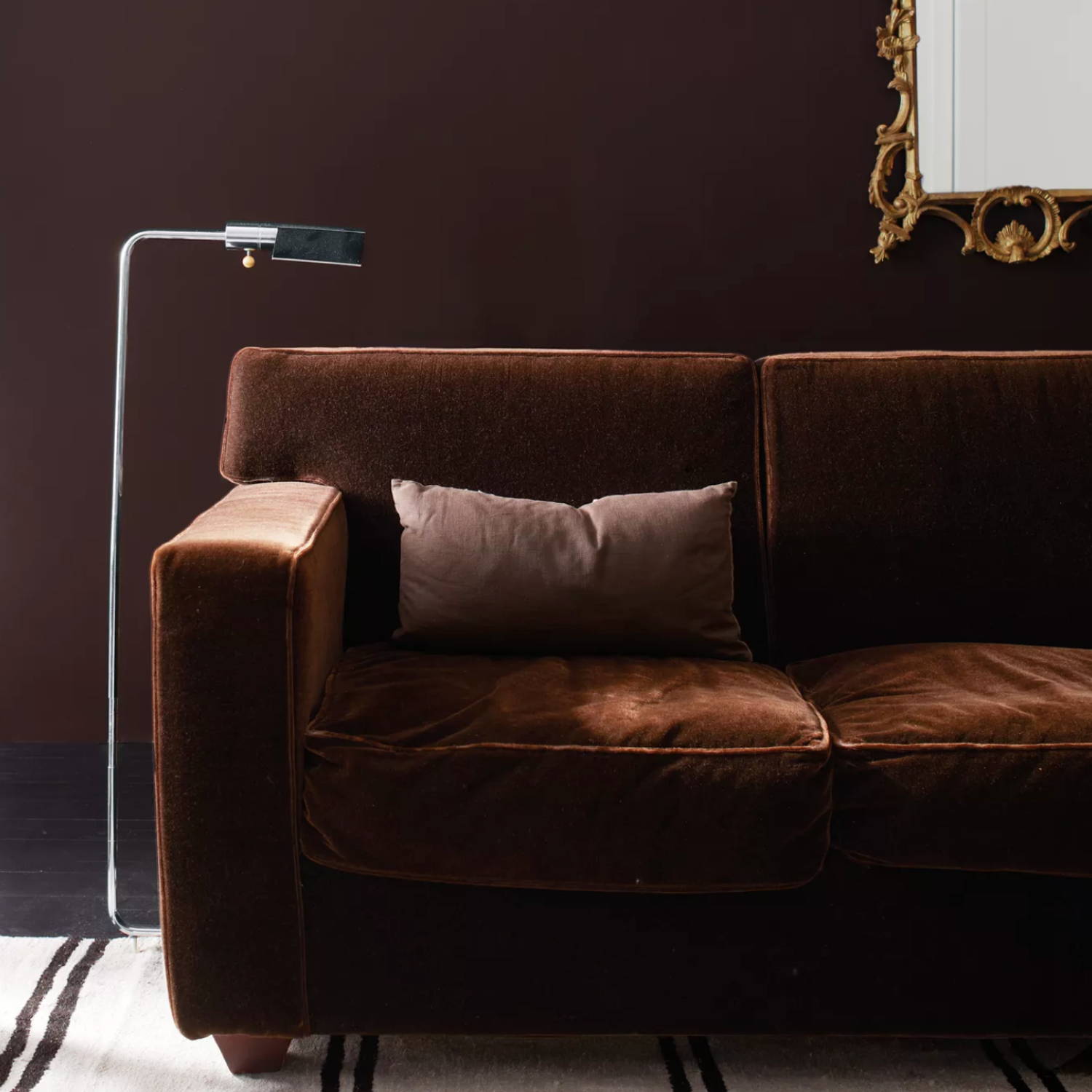
2. wenge, AF-180
Incorporate a little drama with this dark, moody but welcoming shade. Pairing beautifully with a crisp white, Wenge can be used extensively in both interior and exterior paint.
"A deep chocolate with hints of brown, black, and violet in its undertone, this enigmatic hue combines both comfort and drama. Warm and engaging, Wenge is ideal for amping up saturation in rooms with predominantly neutral walls or bringing balance to a space with a lot of color."
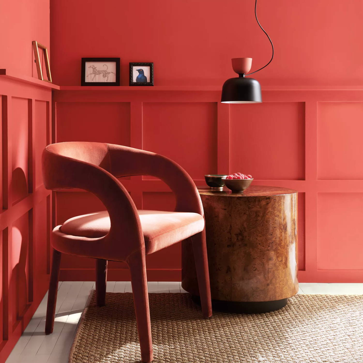
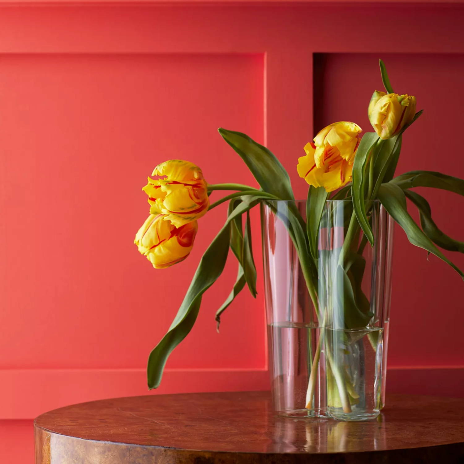
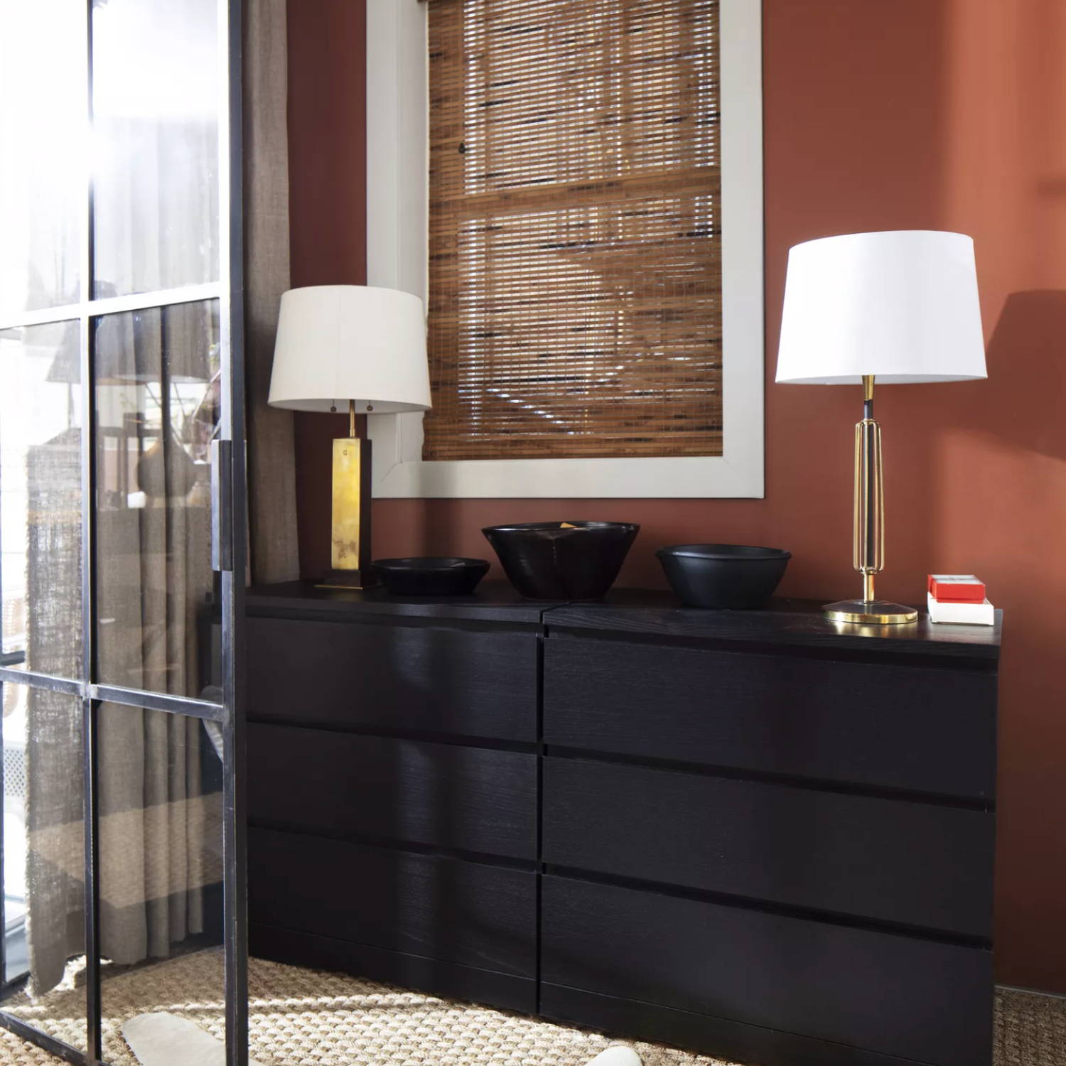
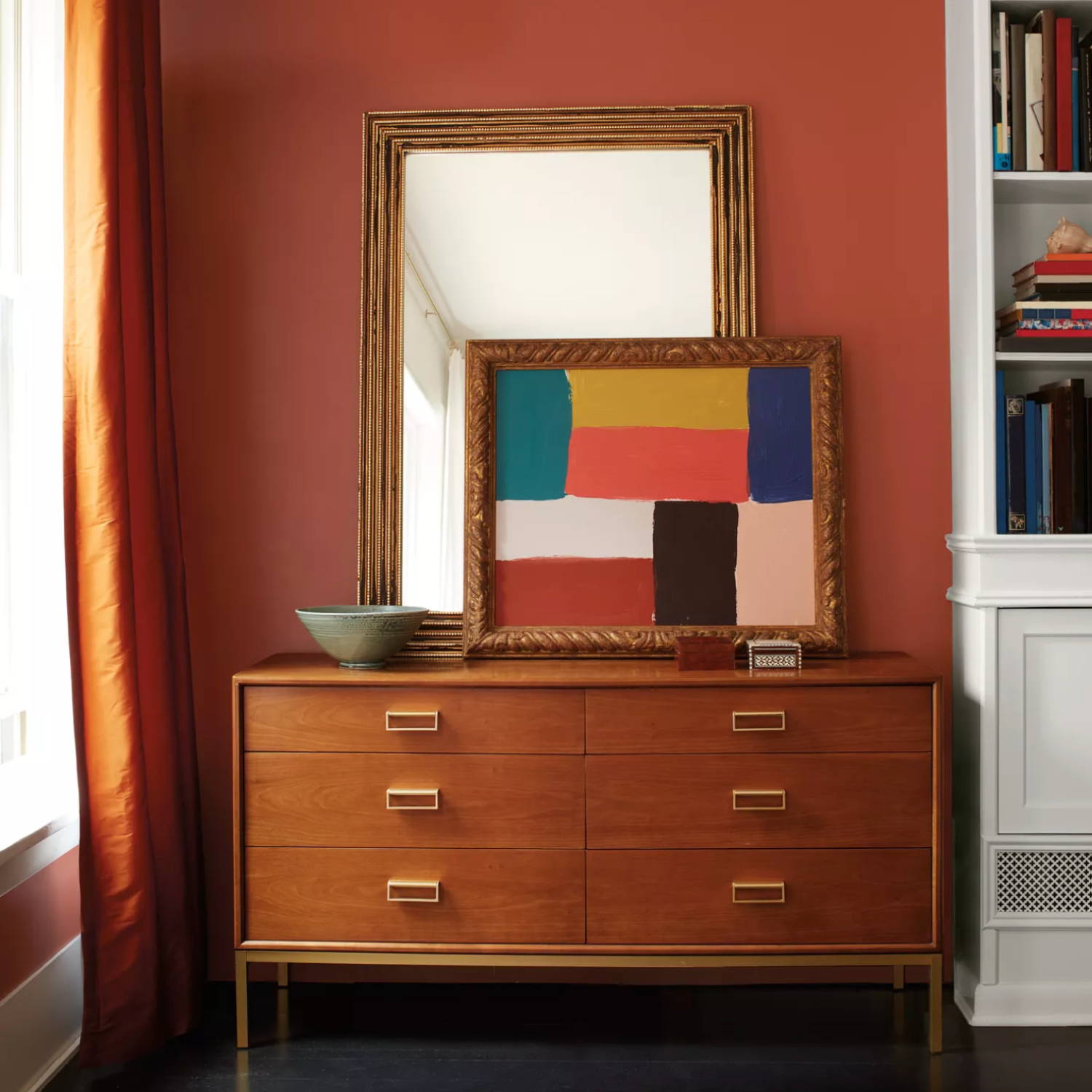
3. cinnamon, 2174-20
Do you also immediately think of Autumn and warmth when you hear the word cinnamon? There is something so comforting and welcoming about this shade. A mixture between rust, pumpkin and ochre, Benjamin Moore's Cinnamon can be used effortlessly for interior walls or can be added into your spaces through upholstered furniture, rugs and soft furnishings.
"A rich brown touched by orange undertones, this warm hue will have you questioning the very definition of a neutral. Cinnamon is an excellent bridge between neutrals and more saturated shades–if you find you’re looking for a bolder neutral, or a more neutral hue that still feels like a focal point, Cinnamon is the spice for you."
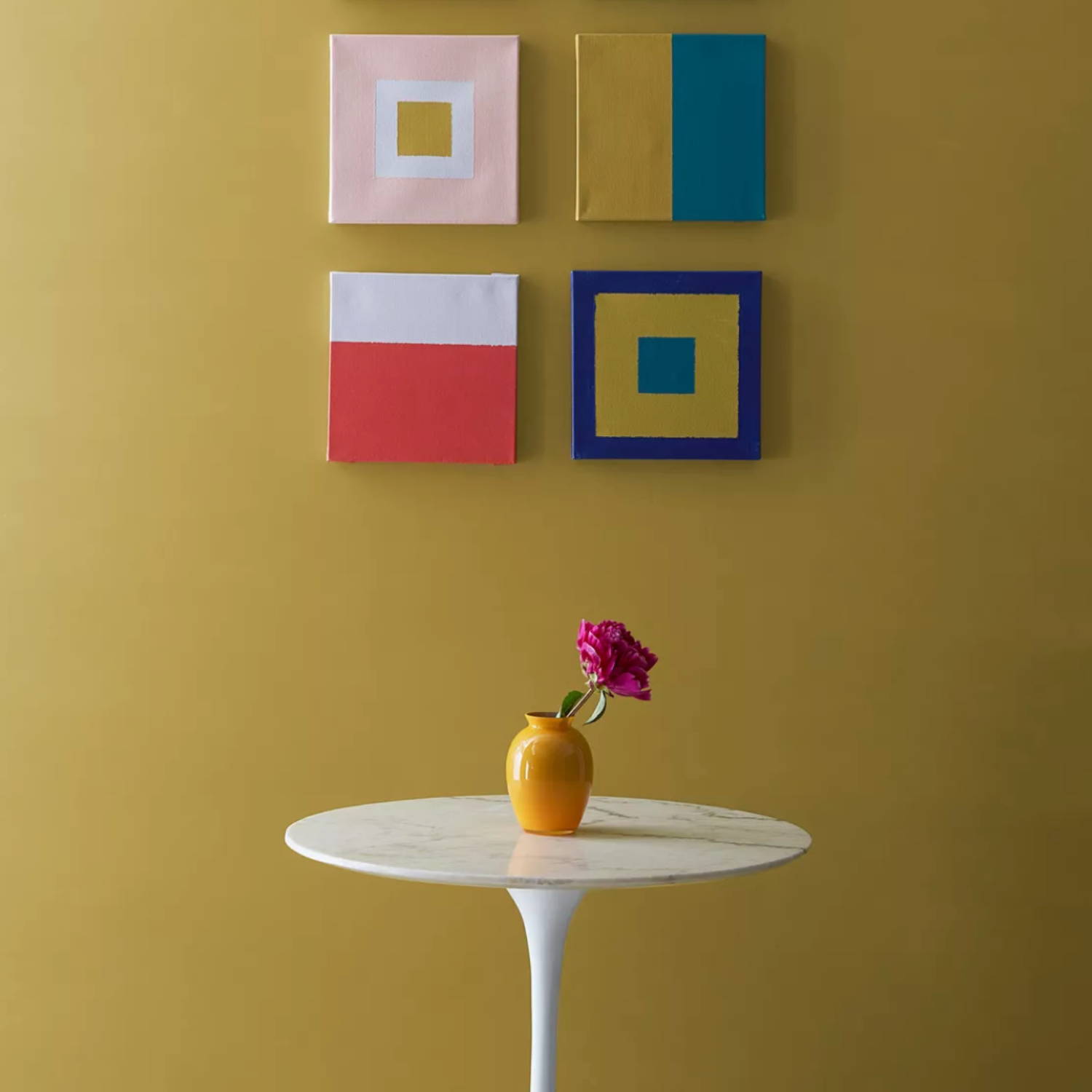
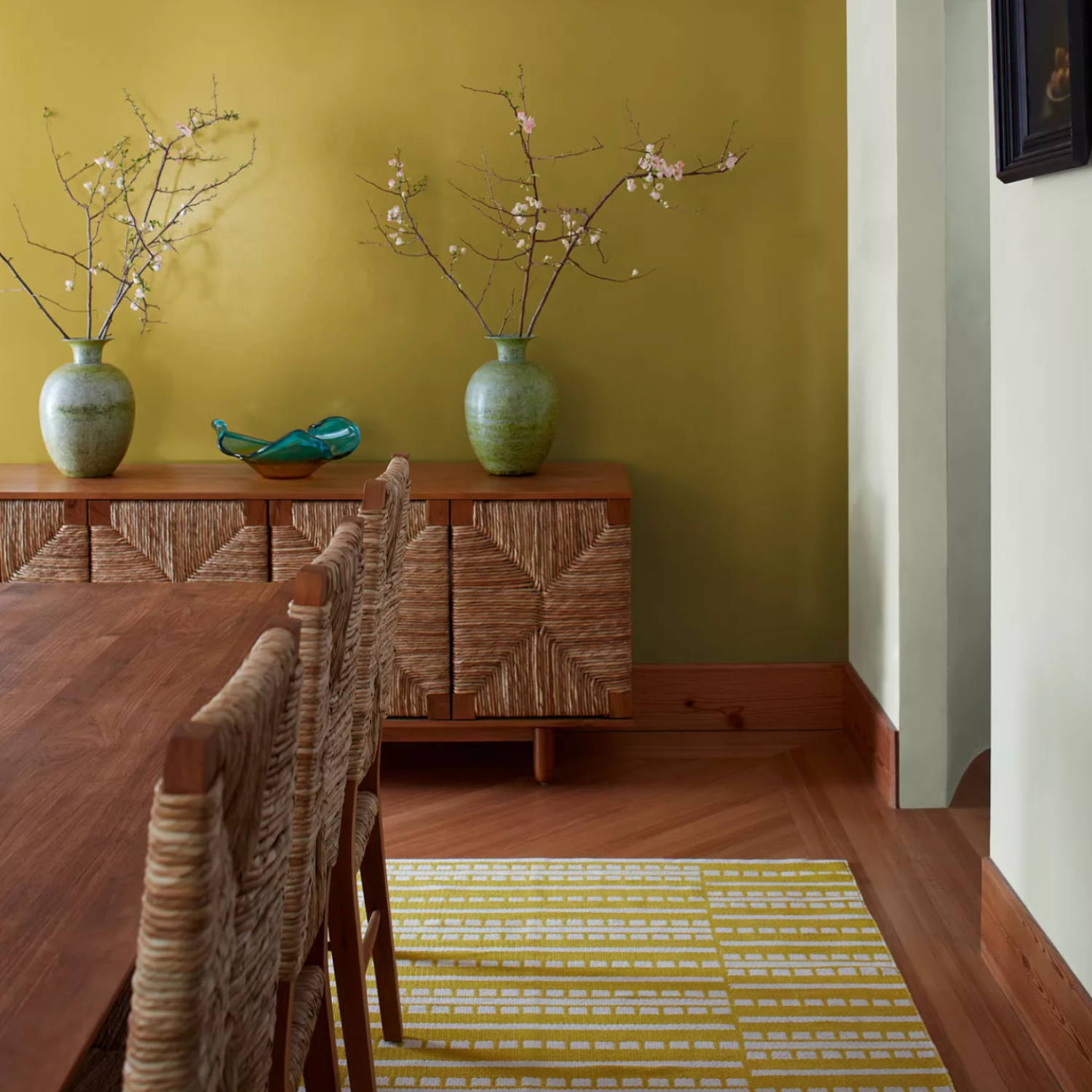
4. SAvannah Green 2150-30
Savannah Green is one of those colours that we feel people unexpectedly fall in love with. Not quite a yellow, nor a brown, this citrus-inspired, earthy hue instantly brings nature indoors and works well in almost any space. (We love how effortlessly it pairs with crisp white!).
A rich ochre, yellow and green undertones balance out this unique hue. Similar to gold leaf for your walls, Savannah Green is a statement-making shade that plays well with neutrals and saturated hues. Offering both whimsy and drama, explore higher sheens for a lustrous take on this sprightly hue.
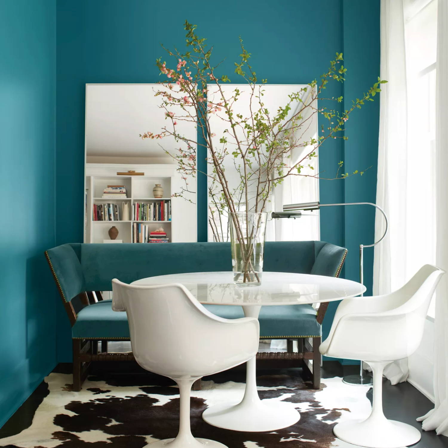
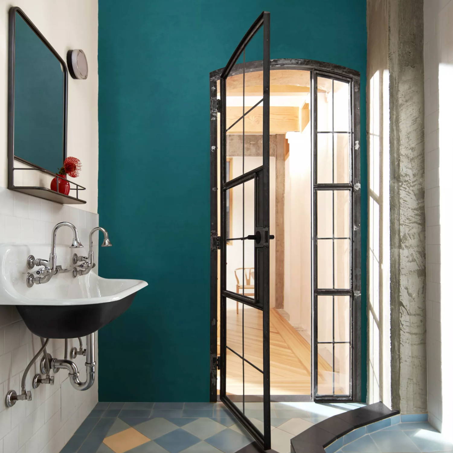
5. North Sea Green, 2053-30
A turquoise-teal-green hue, Benjamin Moore's North Sea Green feels fresh! The blue colour family is already associated with relaxation, while green is known as an invigorating hue. Pair those two colours together, and we have North Sea Green which is a shade that will work brilliantly in bedrooms, living rooms, dining spaces and even bathrooms. Turn your en suite into a soothing getaway with North Sea Green or paint a cosy dining nook to create an intimate, informal entertaining space.
"Sink into this saturated shade, which blends the relaxing vibes of gray-blue hues and the simmering pleasure of blue-green. Engaging and deep, this soothing teal has a delicate gray undertone that enrichens this moody hue."
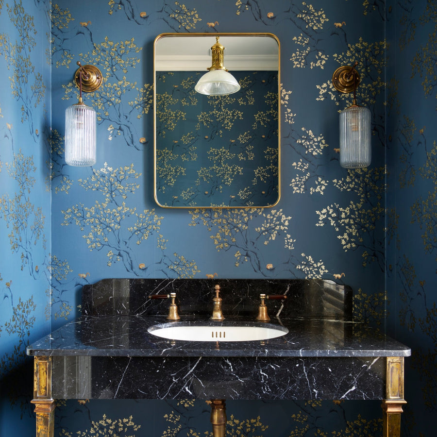
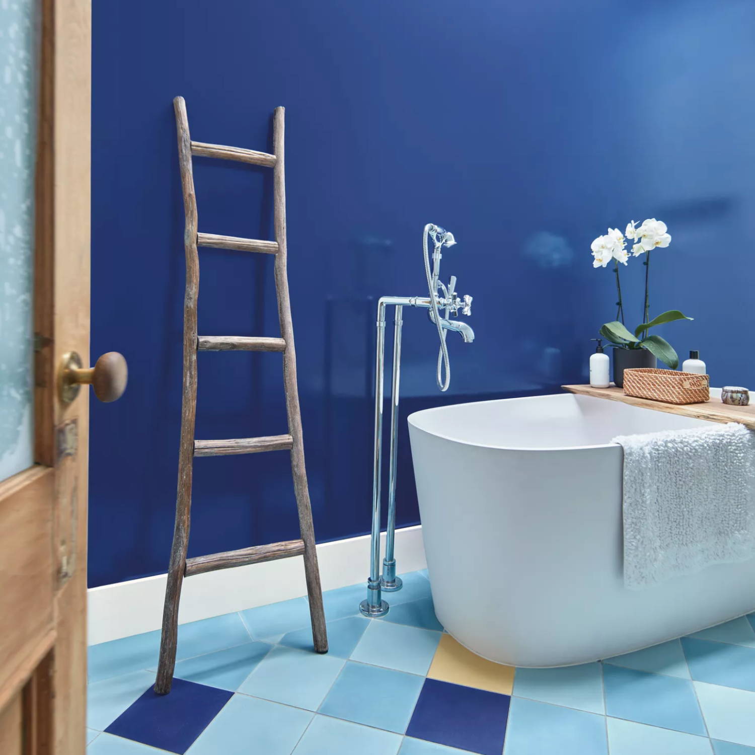
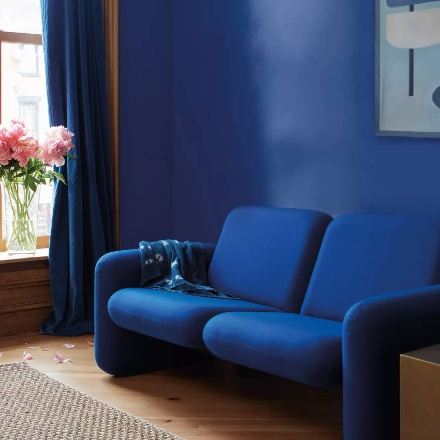
6. Starry Night Blue, 2067-20
Design a serene oasis in the comfort of your own home with Benjamin Moore's Starry Night Blue. Similar to Cobalt / Royal Blue, this shade works beautifully with an array of neutrals, as well as punchier colours such as orange, pink and purple. Be bold and lean into a monochromatic living room with Starry Night Blue walls and sapphire blue furniture.
"A radiant navy akin to the dark indigo of dusk, this inky hue breathes romance into any space. Depth and dimension define walls painted in Starry Night Blue, a captivating hue with just a touch of violet in its undertone."
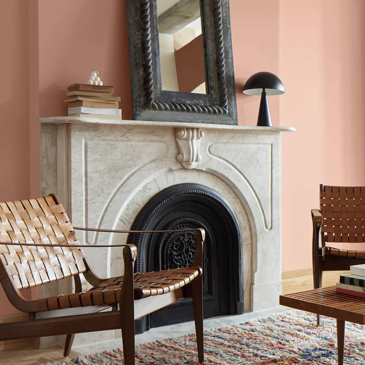
7. conch shell, 052
A comforting neutral shade that works beautifully in transitional spaces, such as a hallway, entryway or powder room. Fusing peach, plaster and blush pink, Benjamin Moore's Conch Shell works wonderfully with mid-Century modern pieces, crisp white and burnt red/orange furnishings.
"A gentle pink reminiscent of sepia tone, this dusty hue brings to mind thoughts of sunsets captured by a vintage film camera. Conch Shell may bring a blush to your space, but this hue is not shy. This comforting color balances out the bold vibes of this palette, appearing almost neutral alongside such striking shades."
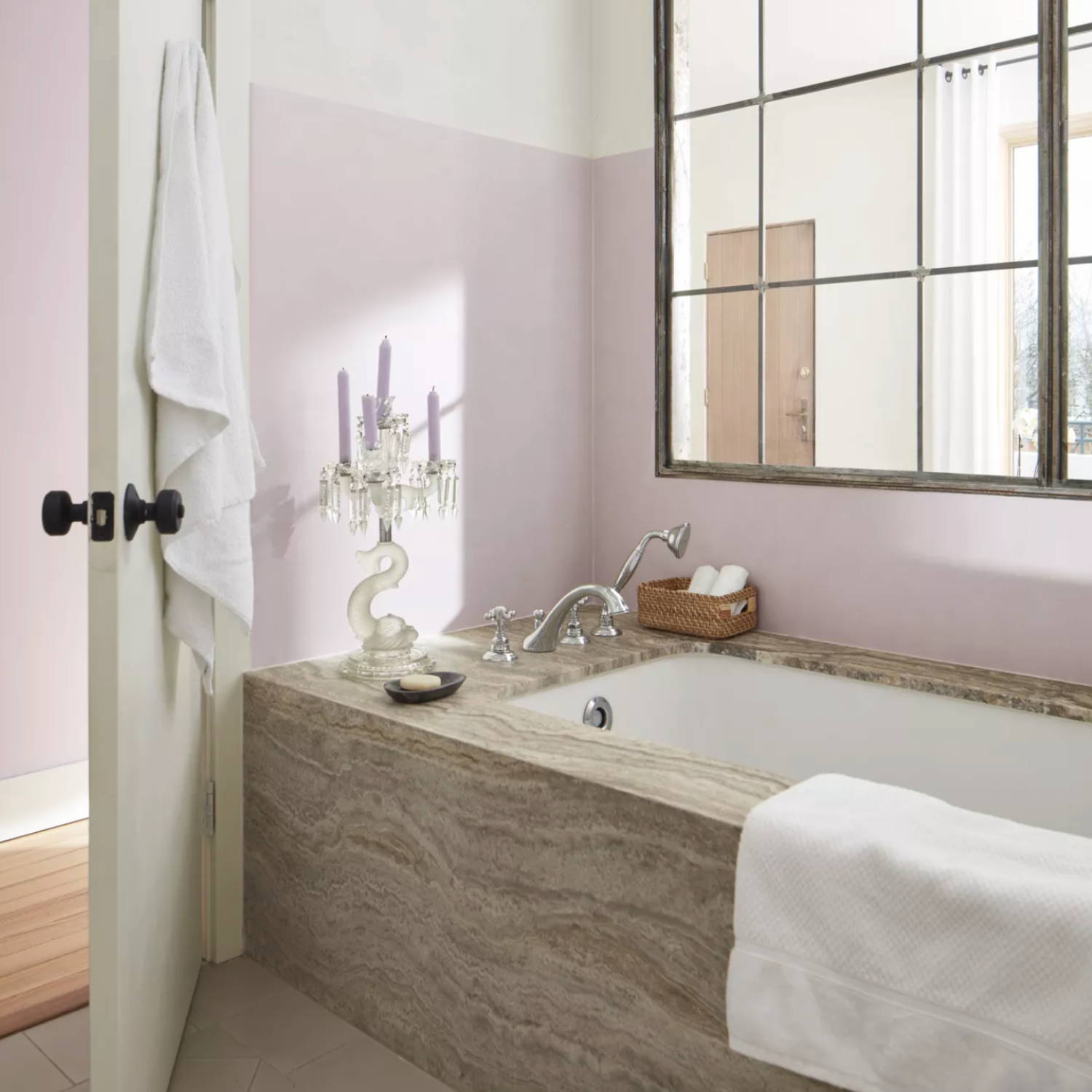
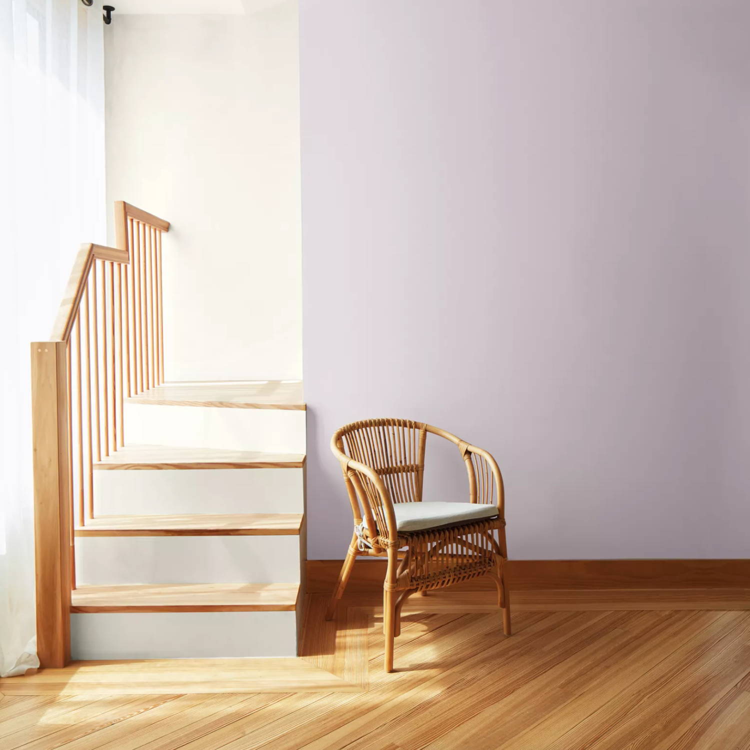
8. New Age, 1444
If lilac were a neutral, it would be Benjamin Moore's New Age shade; a whimsical, dreamy take on the vintage mauve bedroom. Perfect to instantly bring serenity into any room in the house!
"Soft and ethereal, this light purple is grounded by a drop of gray. It emanates a soft spiritual sensibility, leaning into the softer side of our Color Trends 2023 palette. Appearing both gray and lavender, depending on the lighting, infuse a touch of color into any space with this engaging hue."
LOOKING FOR MORE INTERIOR INSPIRATION?
Enter your email address to receive our newsletter